
Writing an introduction is one of the most challenging parts of the IELTS writing module. However, if you have an aptitude-technique, that is not difficult for you at all. The very first thing you need to understand is that writing about tables, graphs, and diagrams is not the same as writing an essay in the IELTS Writing Task 2. In the former, you are not asked to give your opinions on the information provided to you. Instead, you need to describe the information as it is given. Given below are a few sample questions to help you prepare for the IELTS.
Comparisons where relevant –
The graph below shows the proportion of the population aged sixty-five and above, between 1940 and 2040 in different countries. Summarize the information by selecting and reporting the main features.
Related Blog Post: Why you should take an IELTS Practice Test
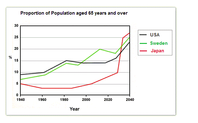
The line-graph shows the percentage of people aged 65 and above in three countries spanning 100 years, providing past data from 1940 onwards, and projections until 2040.
The graph clearly shows that the proportion has increased in all the three countries since 1940, along with some occasional dips. We can see it is expected at a much higher rate, particularly from 2025 or 2030.
In 1940 around 9% of the American population aged 65 and above, compared to about 7% in Sweden and 5% in Japan. The percentage of people in this age-group rose gradually over the next forty years, reaching nearly 15% in 1980. However, Japan registered a slight decrease of about 1% during that time.
There is a sharp increase in the trends from 2025, from being 7% to 17% in that particular segment of the population across all the three countries. The percentage of the population in 2040 aged sixty-five and above is estimated to be around 27% in Japan, closely followed by 25% in Sweden and 23% in the United States of America.
Next Question:
The graph represents the trends in US meat and poultry consumption per capita from 1955 to 2012.
Related Blog Post: Information on COVID-19 for IELTS Candidates

Another question: Summarise the following information by selecting and reporting the main features, and make comparisons whenever there is some relevance.
The graph represents the changes in the patters of the consumption of beef, pork, broilers, and turkey per person in the US between 1955 and 2012.
It can be seen that the rate of the consumption of beef was the highest among the four types of meat for a significant part of the given period. There was an apparent steady rise in the consumption of broilers, exceeding that of beef. However, there were no significant changes in the consumption of pork and turkey during this period.
Being always high, the consumption of beef reached an astounding figure of 90 pounds in the mid-seventies, gradually declining by 2007, to reach an all-time minimum of about 50 pounds per head in 2012. On the other hand, there was a consistent augmentation in the consumption of broilers, surpassing that of beef in 2010, closing at about 58 pounds in 2012.
During the period under study, the consumption of pork kept fluctuating between 40 and 50 pounds. It registered 42 pounds per capita in 2012. The consumption of turkey always remained the least, with less than 10 pounds per capita until 1986, after which it rose a little to be around 15 pounds per head.
Liked this article? We would love to see you spread some love by sharing this article, as it may help many who are looking to study in other countries.
Good luck and all the best!